April 04, 2017
Our Approach to Exterior Color Selection
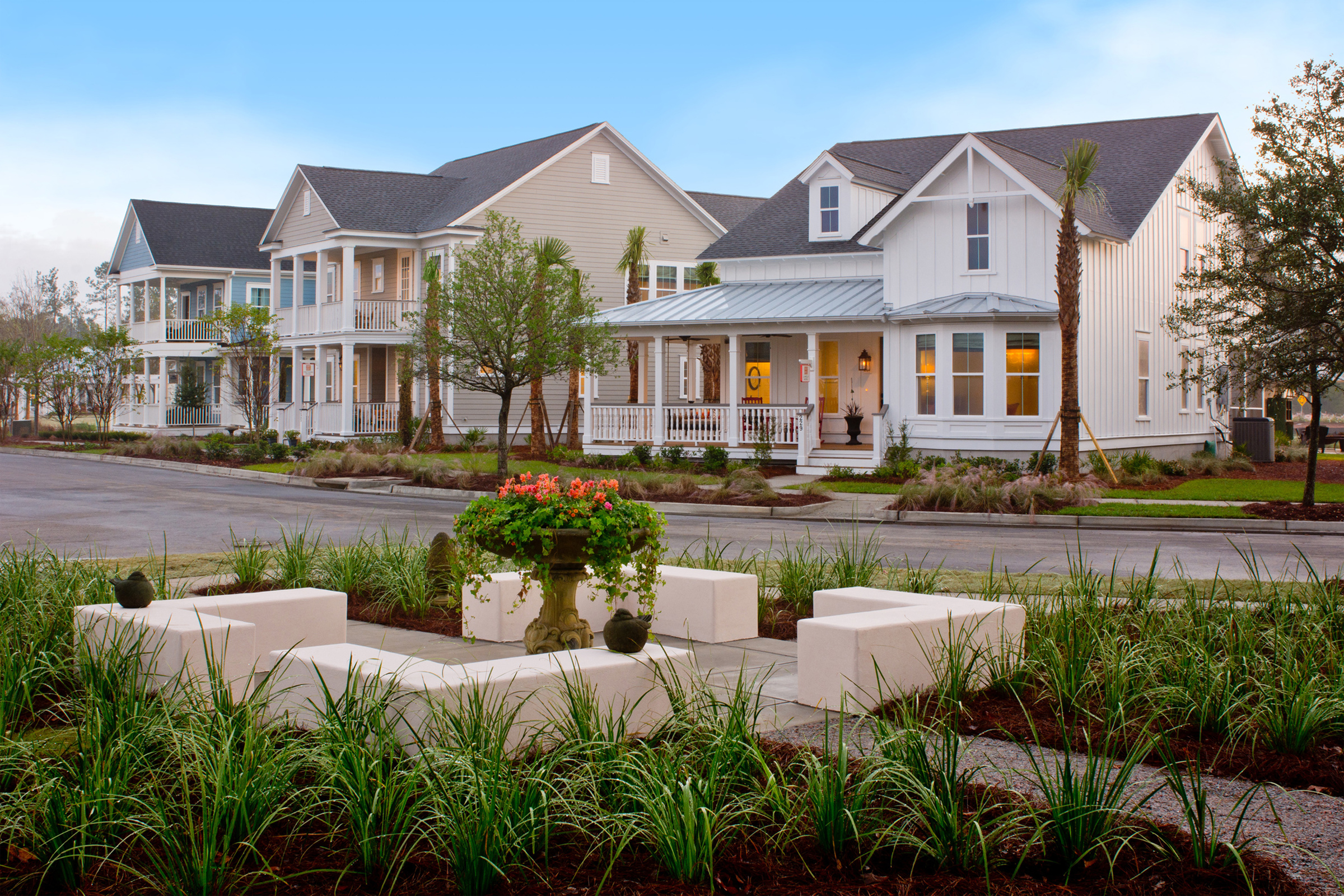
Our team prides itself on our exterior color selection, recognizing color as the finishing touch on exterior design. But over the years, this critical design aspect has been overlooked or left to the future homeowner to select. The result? 50 shades of beige and a bland, why‐bother streetscape. Let’s put an end to that here and now!
Style‐Specific Colors
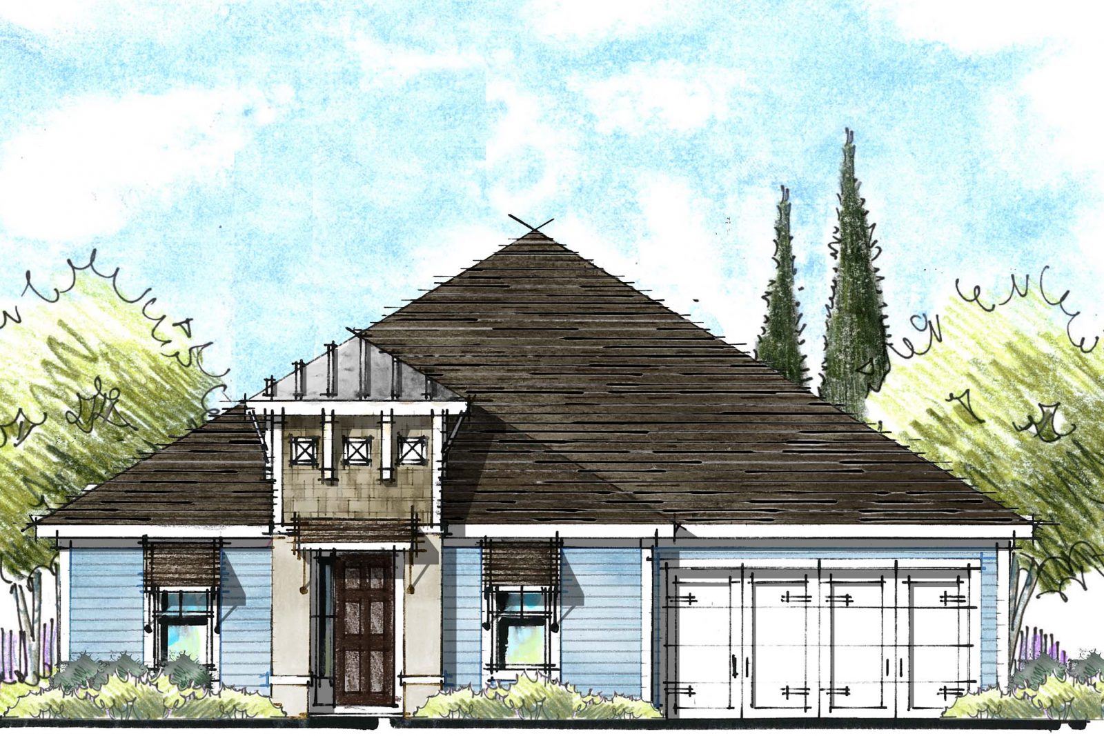
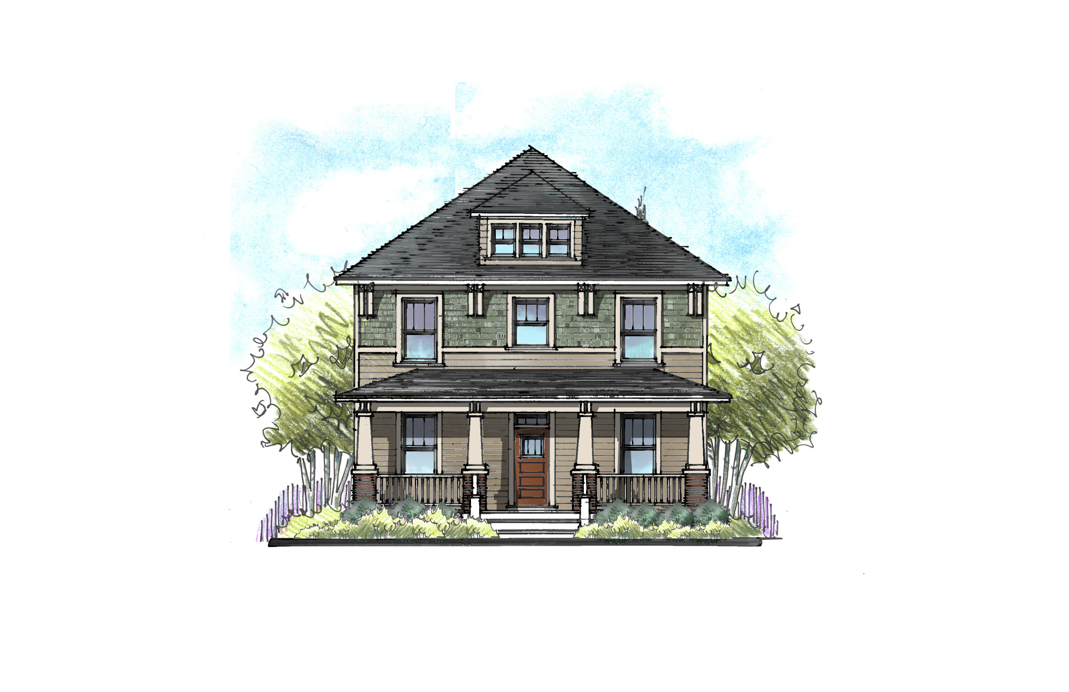
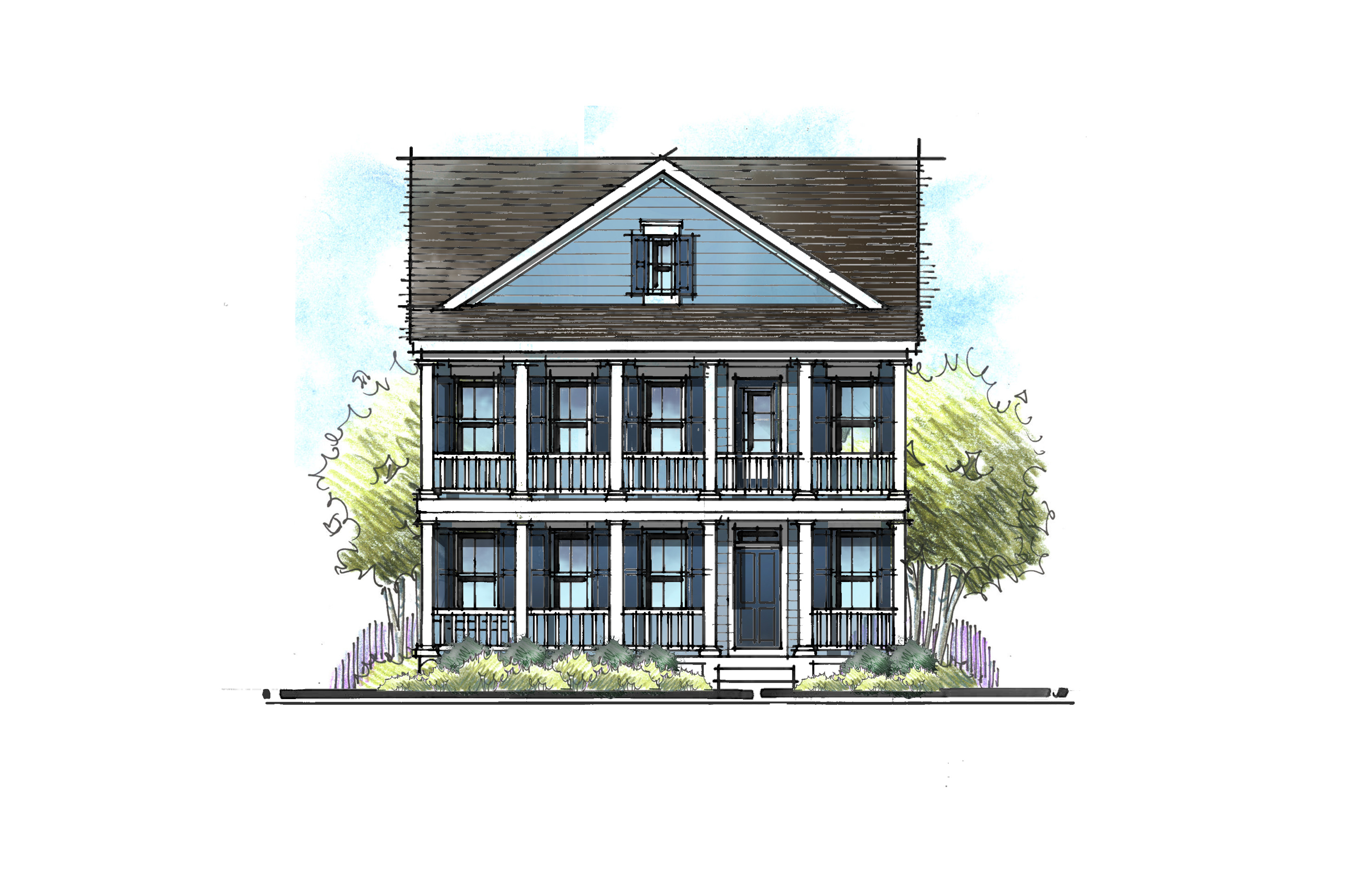
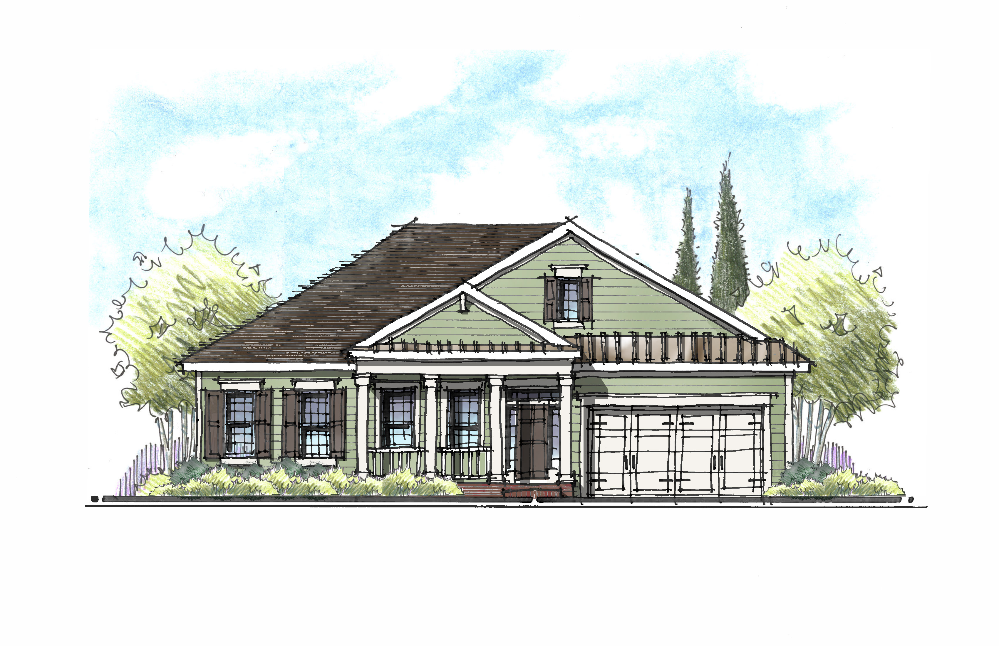
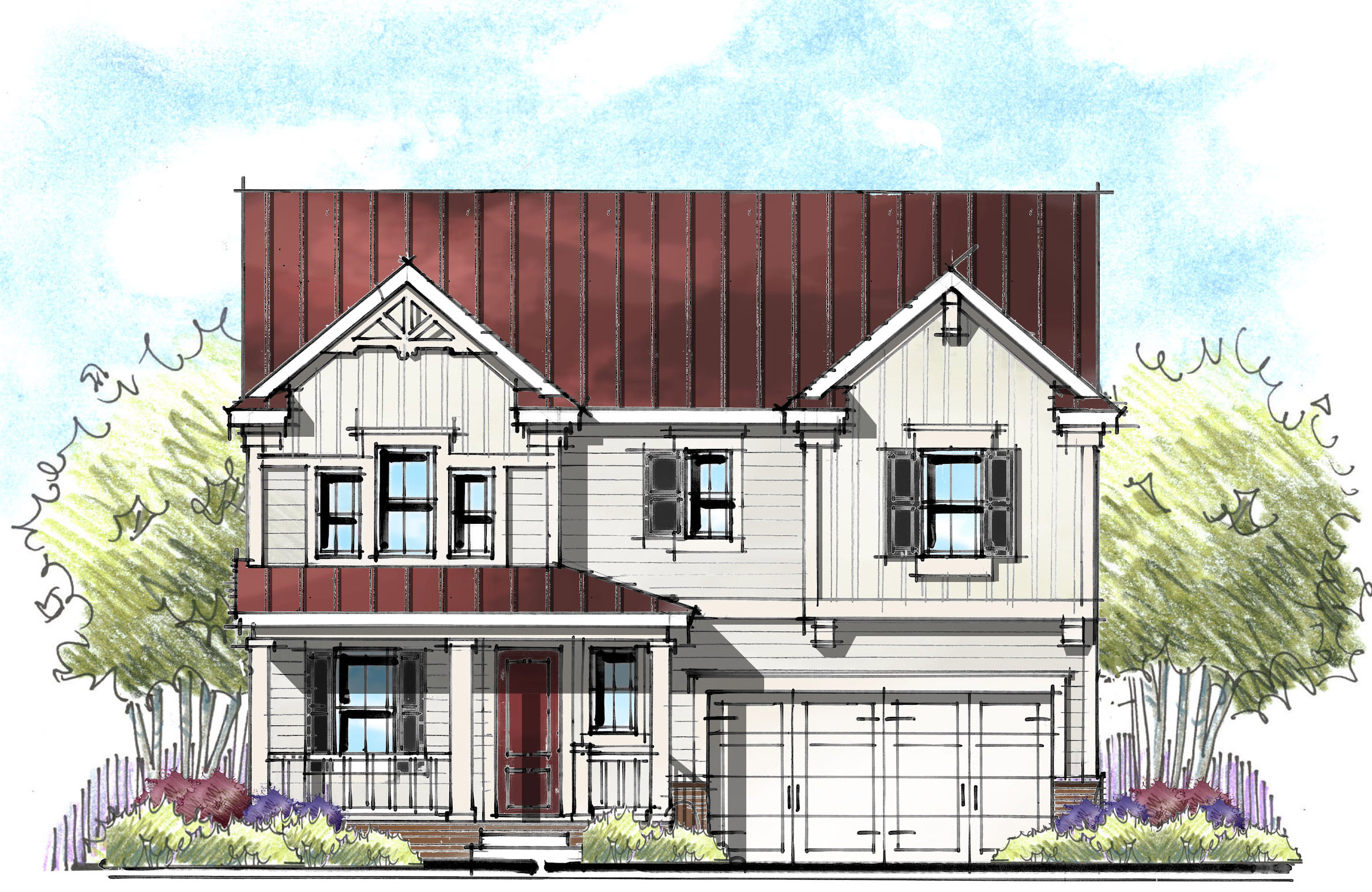
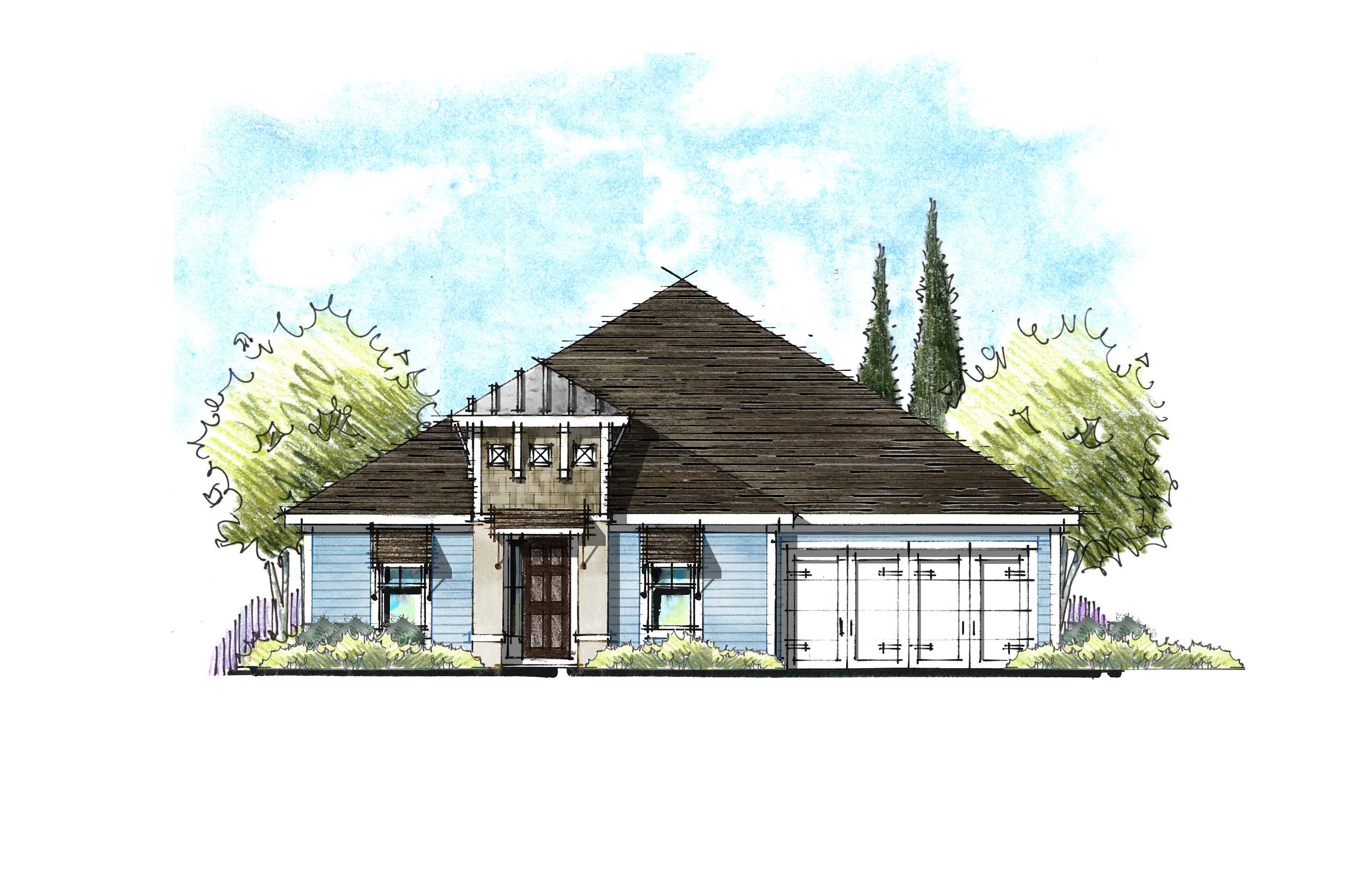
Our approach starts with selecting exterior colors that enhance the architectural style of the home. A Craftsman style, for example, should not have the same exterior colors as a Low Country, Georgian or Spanish Eclectic style. Craftsman tends to have more saturated earth tones while Low Country features light, bright and breezy colors. Each style has a variety of colors unique to that style that serve to reinforce their architectural characteristics.
Use Actual Colors
Within each style‐specific color collection, use real 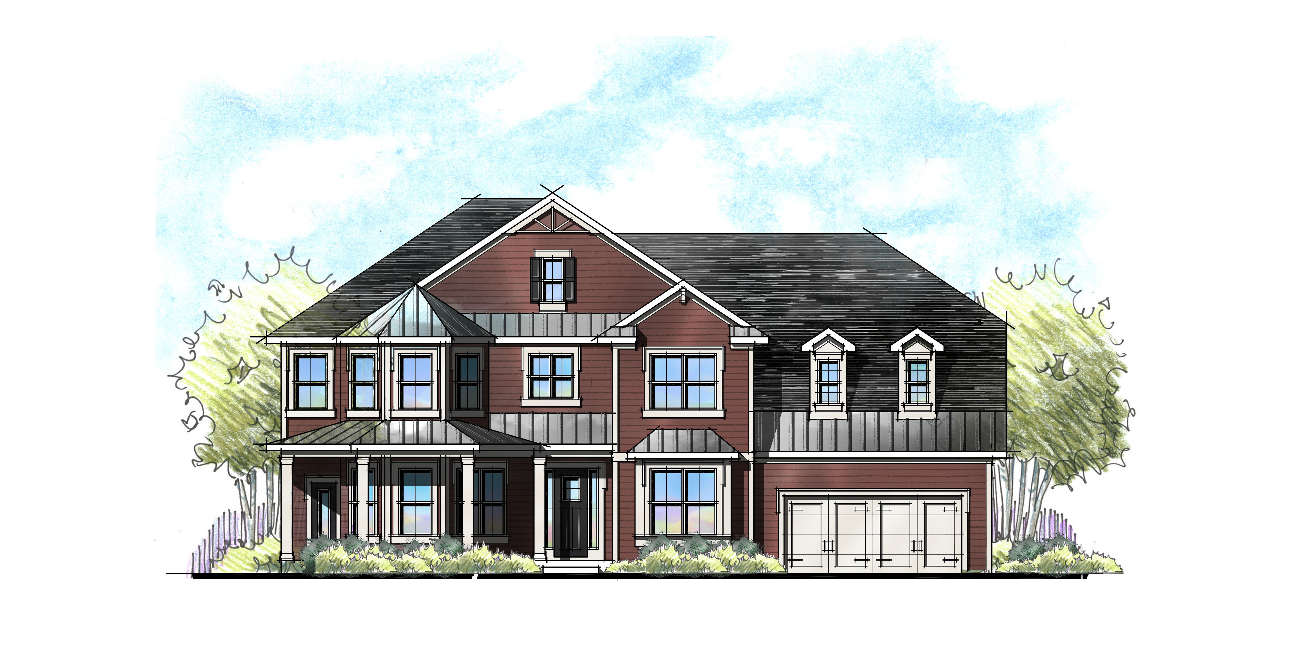 color! Greens, blues, reds and yellows. Yes, these make great accent colors, but they are also fantastic main body colors! Keep in mind that exterior paints are more muted than interior paints. Sherwin Williams has a color palette they call Fundamentally Neutral™. If that’s still too many colors to choose from, look to pre-colored exterior products like Ply Gem’s Mastic™ line of siding or James Hardie’s Colorplus™ siding. These are great places to start.
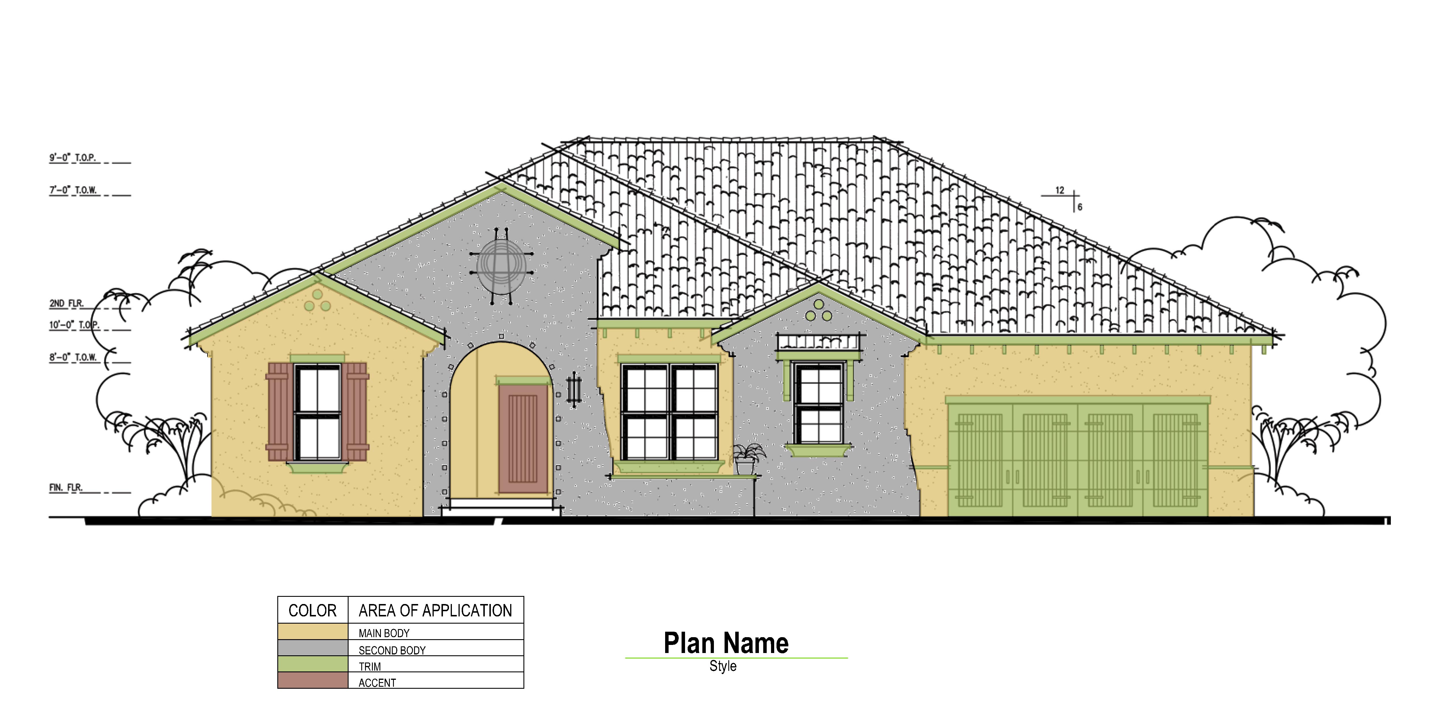
Two Body Colors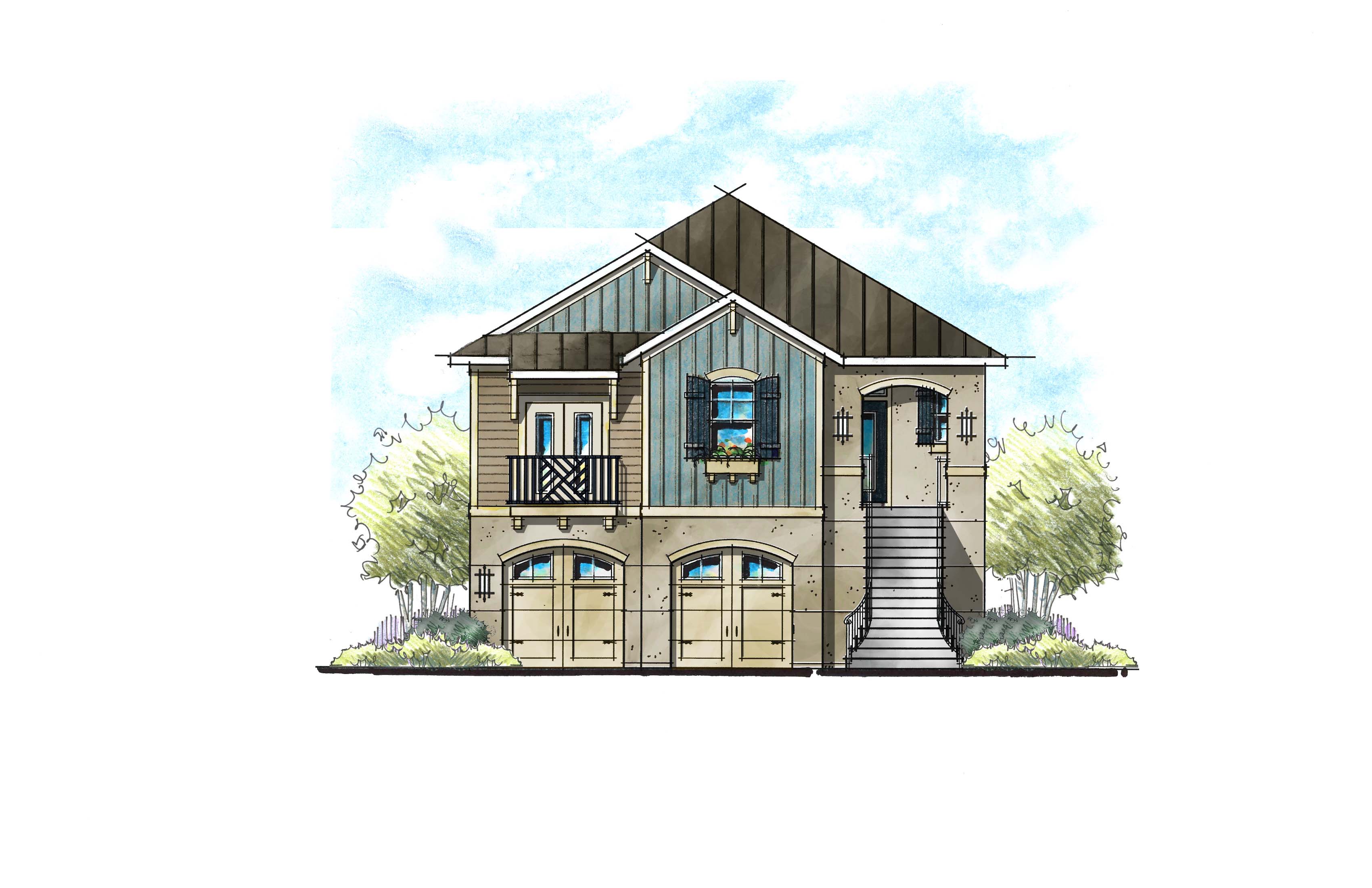
Add animation to the exterior by selecting two body colors; main body and second body. I like a darker second body color around the entry of the home to create a welcoming, more intimate feeling. If your home features two siding profiles, showcase the difference in texture by changing the color – making shake shingles standout from the lap siding or highlighting board and batten as a design piece.
Think Three Dimensional
It is important to visualize where the different body colors stop and start. I recommend transitioning colors on an inside color. If you focus your second body toward the center of the home, you won’t have to carry the color all the way down the side of the home. A color placement diagram is very helpful for both you and your painter.
Bold and Subtle Palettes
Within each style color collection, we like to include palettes that are both bold with lots of contrast and subtle with less contrast. This will allow future homeowners to select color schemes that match their personal preference. Let’s face it, not everyone wears red everyday like me!
Take it Outside
Exterior colors should always be viewed outside. It is amazing how seemingly-dark colors wash out in the bright sun light. Or how the contrast between siding and trim colors seems to diminish. Additionally, sunlight is full-spectrum light while interior lighting is not and can shift greatly depending on the type of light. Incandescent lights (does anyone still have those bulbs?) are very amber while fluorescent are more green.
Streetscape Squint Test
The last and final test is to arrange all your selections so they to be viewed together, much like the will be seen in your community. Then give it the squint test: squinting your eyes halfway cuts out the noise and allows you to see the essence of your selections. If you have fifty shades of beige, it will show as one giant beige blob. But if you have color and tone diversity, it will show through when you squint. Try it! Take your existing collection of colors out of the “color selection book” and lay them all out together and you’ll get the idea.
Categorized in: Exterior Colors
This post was written by Housing Design Matters