September 28, 2020
Color Blocking vs “Blotching”
Color blocking is a technique for applying color used everywhere. You’ll often see this technique used in architecture, interior design, and fashion. It can be bold or subtle. But most importantly, it is an effective visual tool.
Interior designers use color blocking to add excitement and interest to their models, leaving a lasting impression on anyone who visits them.
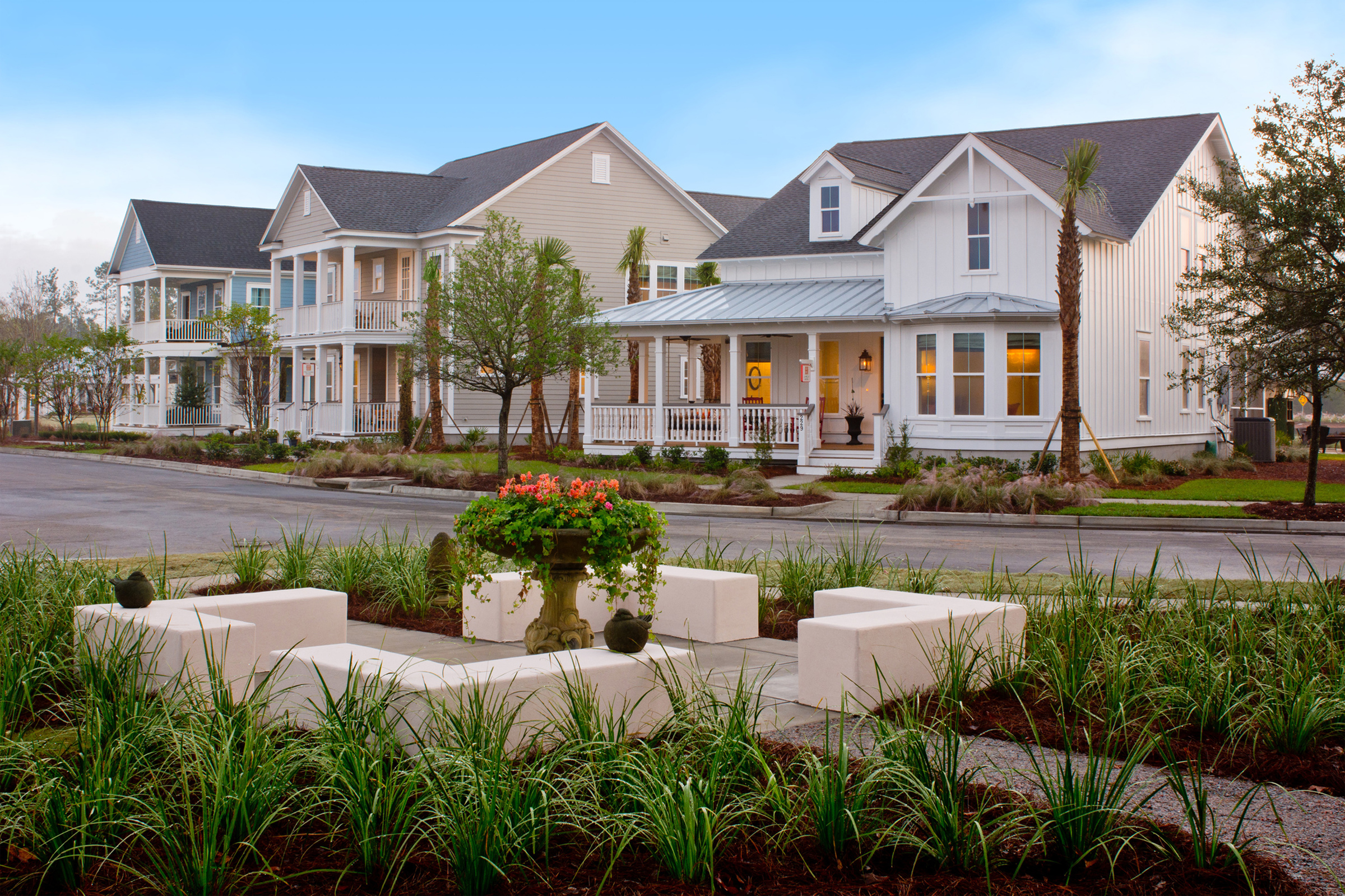
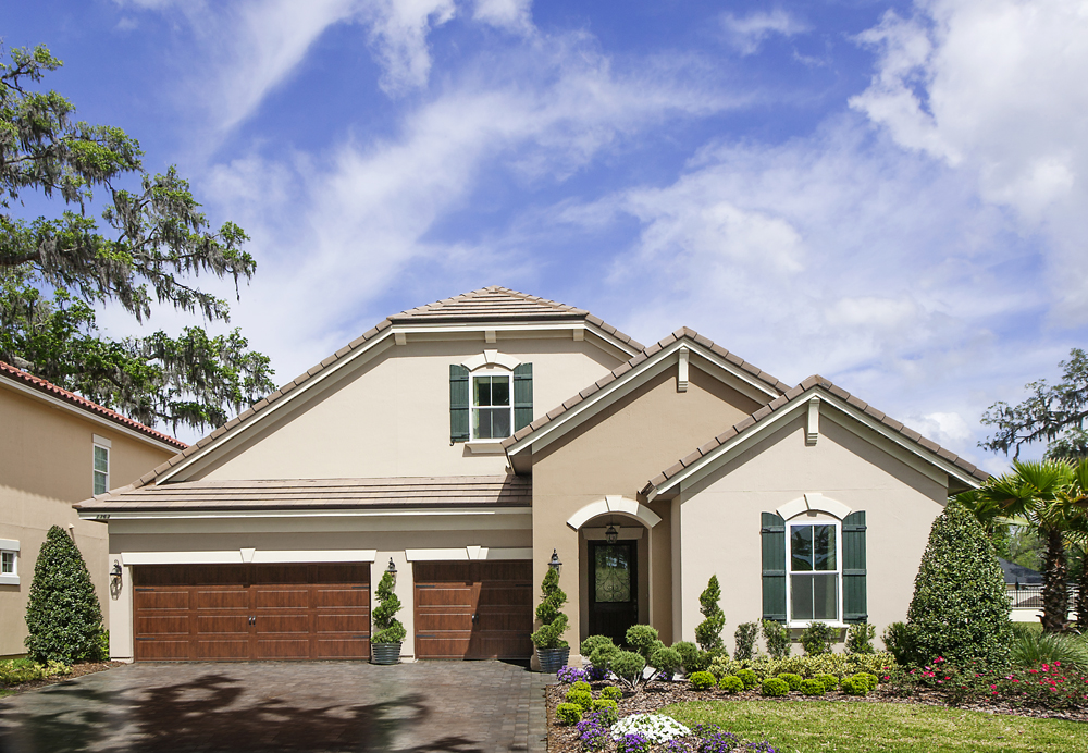
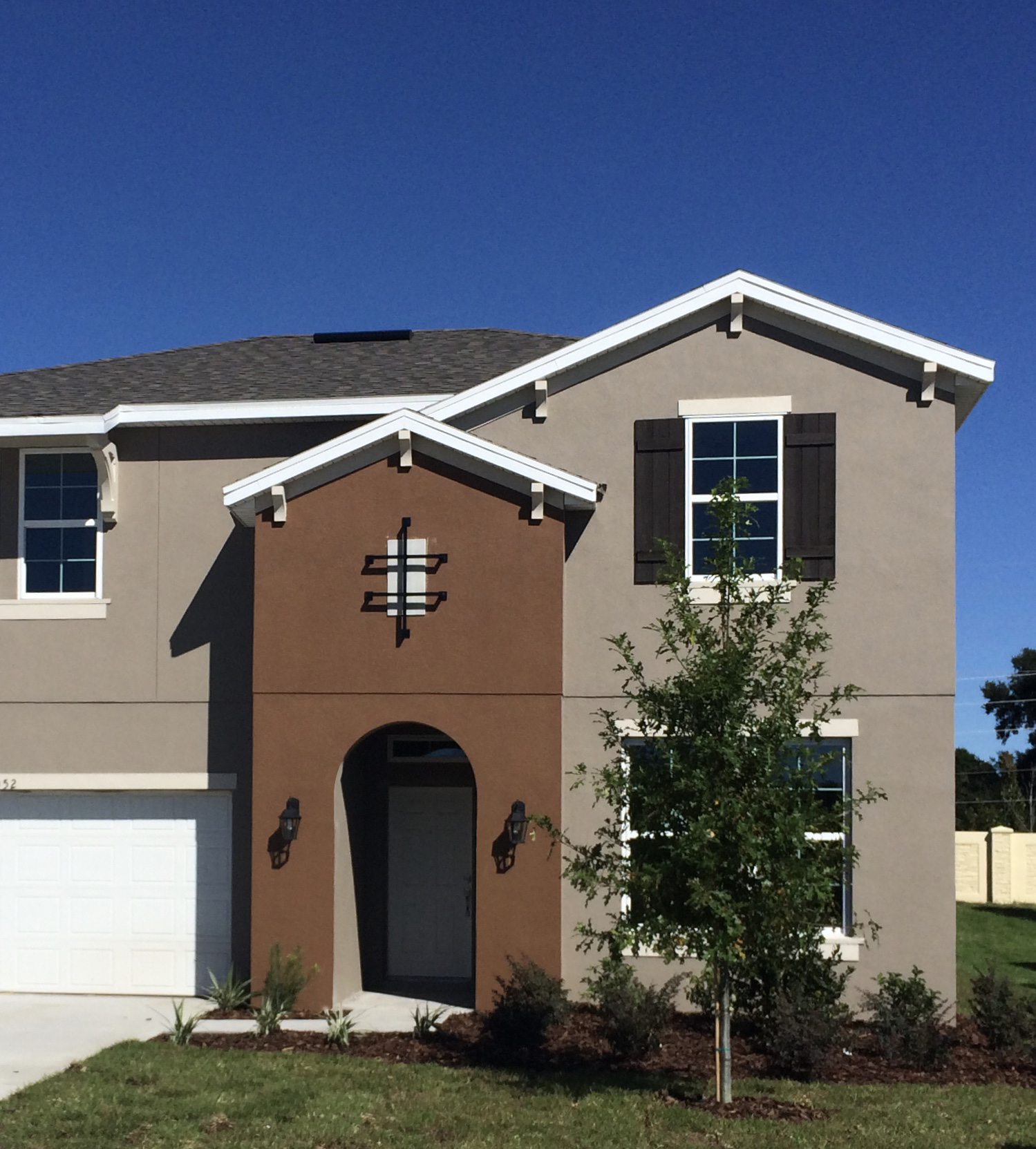
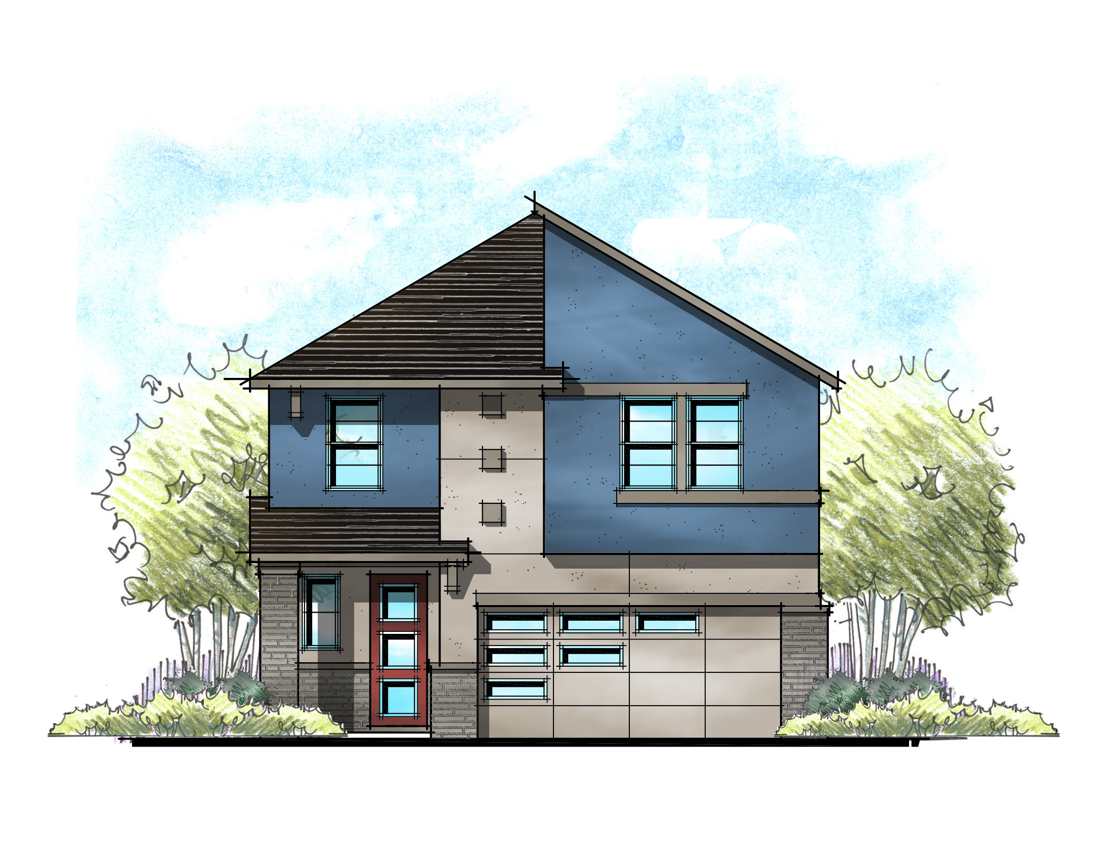
In single family designs, color blocking is a great way to add interest to the front elevation. Adding a second paint tone can be especially effective in bringing animation to a single material elevation. Let’s face it, an all beige stucco house is nothing to get excited about. Add a pop of color, and just Emeril Lagasse, “BAM”!
Beyond Paint
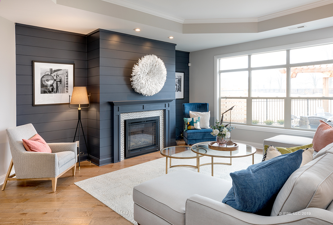
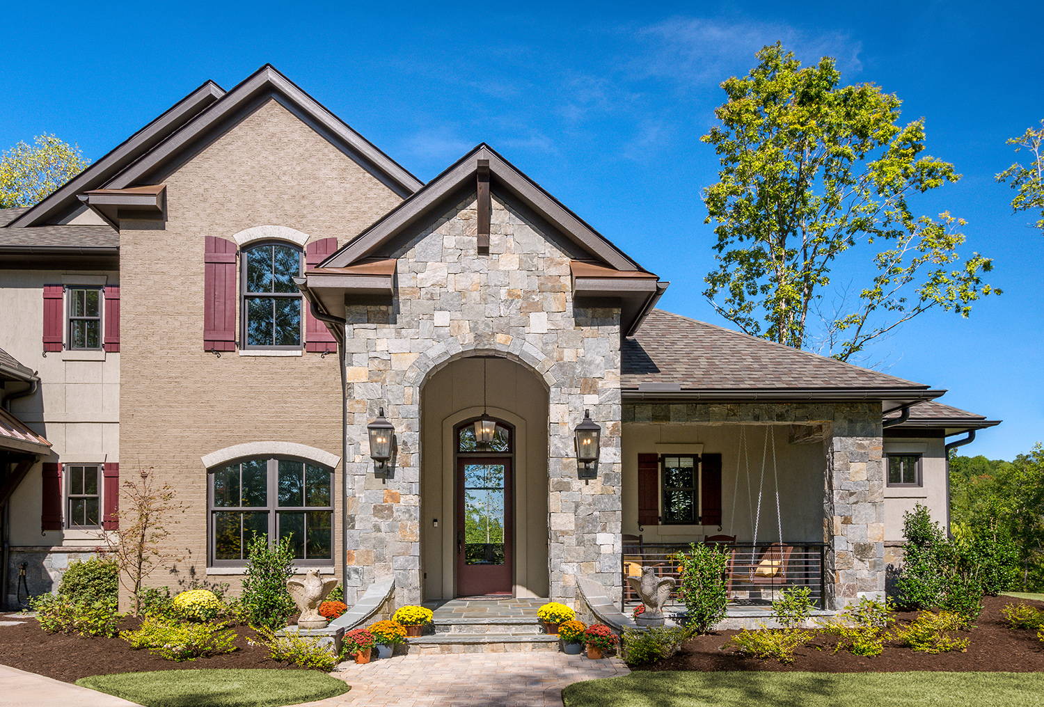
You can also use a change of material to add color blocking. I like to use color blocking to highlight and emphasize the entry of the home. It doesn’t have to be limited to just the application of paint. Using different textures and materials can accomplish the same animation and emphasize the entry. I like the example of stone, painted brick, and stucco to add richness and texture to this French country exterior.
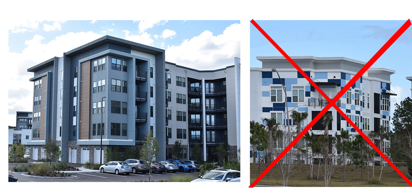
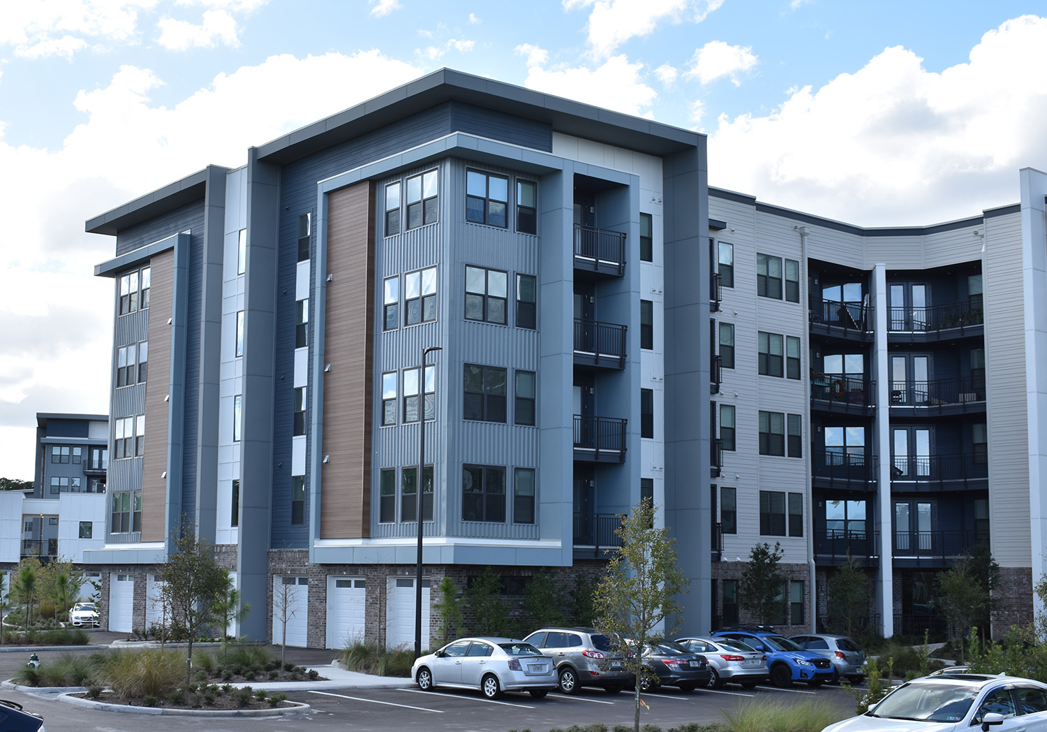
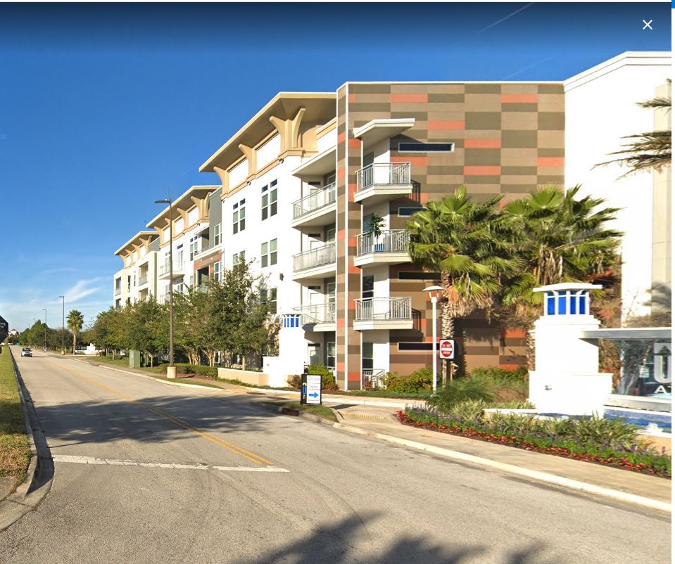
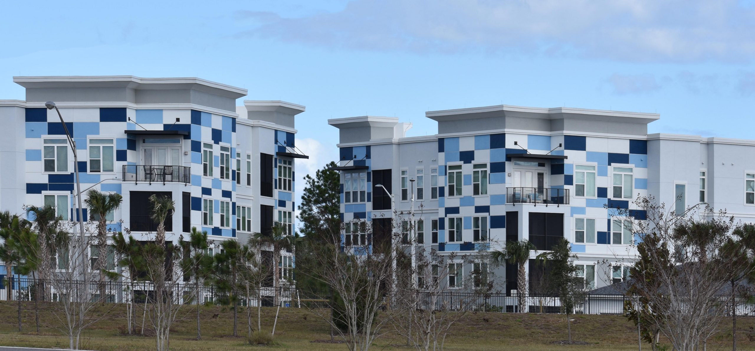
Admittedly, my favorite application of blocking is in multifamily. Take a big, monolithic building form and then apply different colors and materials to break up the mass and add visual interest. Driving around Jacksonville, we found some great examples. Most trend towards the modern end of the spectrum, but not all.
In Greenville, SC where we spent time this summer, we found great examples of color blocking using different colors and textures of brick. The examples are both modern and traditional and dispels the excuse that just because you’re limited to one building material, like brick, doesn’t mean you can’t use color, texture, and variety to create animation in the exterior.
Alas, a new trend has emerged in color application to exteriors. I call it Color “Blotching” and I am not a fan. It looks like a colorful patch work quilt applied seemingly carelessly to the building. This is using color blocking all wrong. The scale of the blocks doesn’t match the scale of the building and does little to diminish the mass of the building. I believe this technique will quickly become dated.
But what do you think? Do you use color blocking to bring visual interest to your homes? Have you seen any examples of color blocking gone wrong?
Categorized in: Exterior Colors, Exterior Styles
This post was written by Housing Design Matters