
February 09, 2026
Don’t Overlook Your Outlets and Switches!
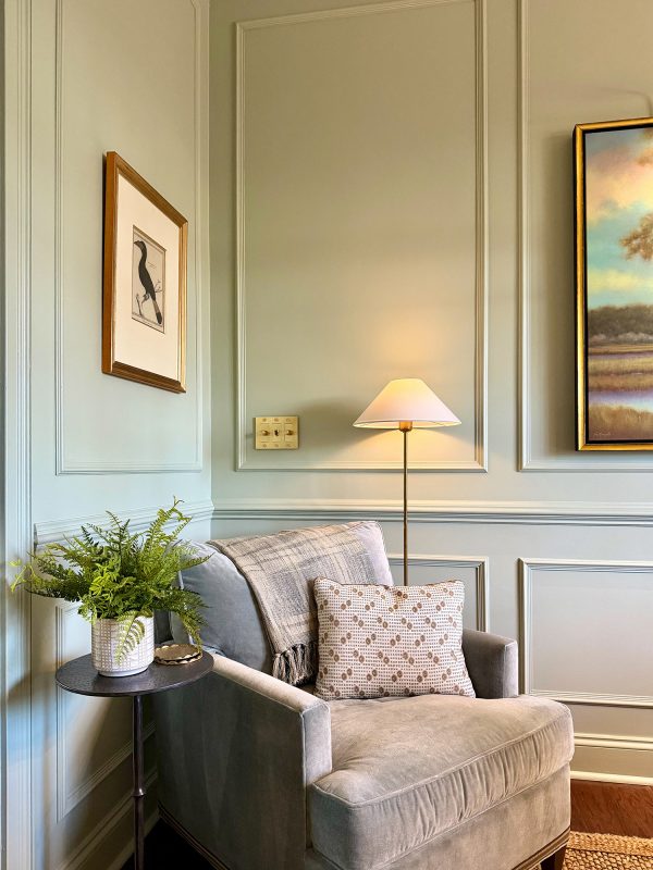
Switches and outlets are an essential part of our built environment, being used multiple times throughout the day. Yet to some, they must be invisible. Or perhaps, they just don’t know there are choices other than builder beige or white.
Your basic big box home improvement store sells and stocks 10 different colors including:
- White
- Ivory / Almond
- Light Almond
- Black
- Gray (including several shades)
- Brown
- Red
- Blue
- Green
- Stainless steel/brushed nickel
If a selection is made, many homeowners only consider their wall color. White is the most common selected today. The light almond color was the most common color in homes built in the 80’s and 90’s. If you’re updating your color scheme in a house from that era, you might need to also update your electrical devices’ colors.
But even in new construction, it is too easy to pick one color for the entire home. With this approach, you end up with mismatched devices in some very key areas.
Kitchens
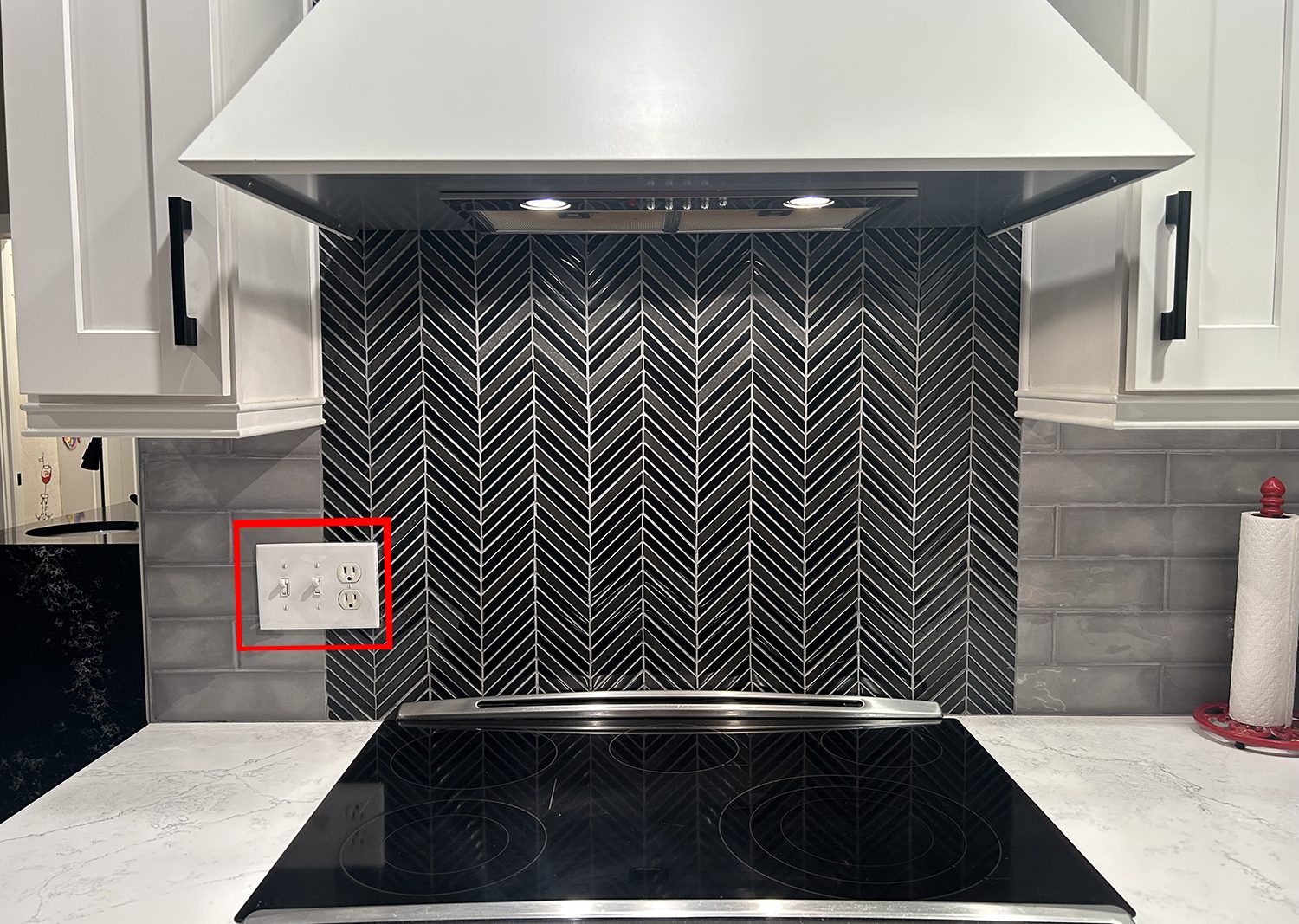
Buyers will obsess over their backsplash material and color. Perhaps they decided to add a slick glass tile backsplash. But if they don’t select a color coordinating switch and outlet, their devices may become the focus and not their expensive upgraded finishes.
This oversight is especially egregious when the contrasting outlet isn’t installed straight. Something that might have been less noticeable had it been a color that blended with the backsplash.
The ultimate foul is when there is a change in the backsplash pattern and material – like behind the stove and it too is ignored when selecting the electrical devices color. In this example, the mismatched device – which was actually an outlet and set of switches lapped over both tile patterns.
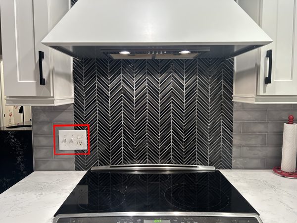
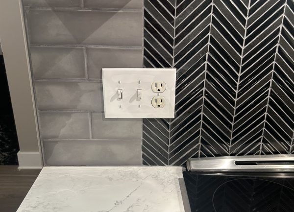
Sadly, this isn’t easy to remedy with a trip to the home improvement store since the tile was cut around the electrical device. Brutal.
The next common mistake is forgetting about the outlet on the side of the kitchen island.
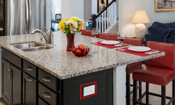
Chances are the color of the cabinet contrasts with the color of the backsplash; therefore, a different color is needed.
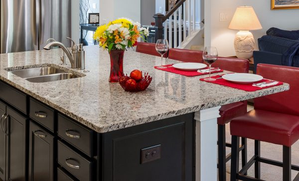
But wait! They may need a third color in the kitchen when you consider how many switches and outlets will be the walls – which I’m assuming aren’t the blue, black, or wood tone of your island.
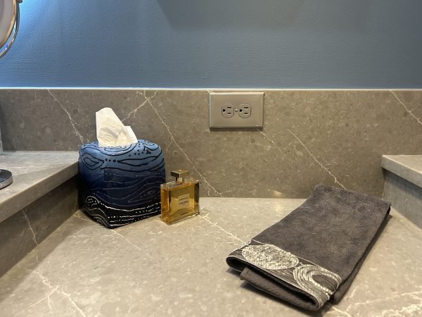
The Bathroom
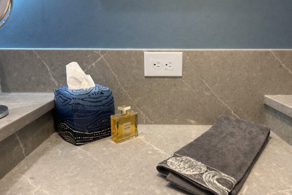
A recent bathroom remodel included all new quartz countertops and backsplash. In this application, there was a knee space between two vanities at a lower level. The 6” backsplash behind each sink was carried straight across the drop area creating a large backsplash of 10”. Sadly, in the sea of variegated gray was a bright white outlet.
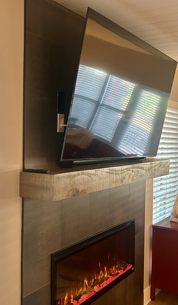
The Fireplace / TV
The next place where outlet color should be considered might be the finish around the fireplace – especially if there is going to be a TV mounted above. You might think the TV will hide the outlet – maybe. But if the TV is angled down for viewing by those seated lower, the mismatched outlet can be viewed from the side.
The Last Pet Peeve
Okay – so you got the right color. Please take care during installation so that is it straight. Some people even care about the direction of the two screws securing the plate. They need to be facing in the same direction.
What do you think?
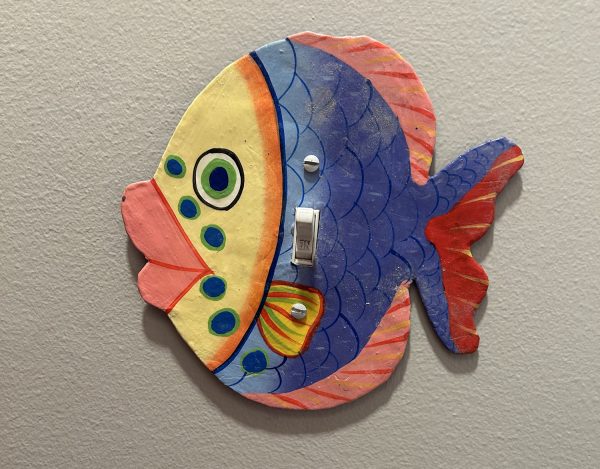
I bet there are some of my readers who haven’t given this much thought to the color and position of their devices – only that they are convenient when they need to charge their cell phone. But switches and outlets can be one of the easiest ways to make or break a room. Do you notice when an outlet throws everything off? Send me a snapshot of any outlet faux-pas, or perhaps an example of an outlet done right! Below are a couple of different directions one can go beyond the standard plastic rectangle.
Why not have fun with it?
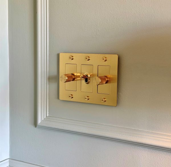
Alternatively, instead of matching to the wall color, you can elevate your switchplate not only visually, but tactically as well to coordinate with the finishes of the room like this brass piece with a knurled switch and knobs.
I’d love to see your best and worst, so be sure to send me your favorites!
Categorized in: Uncategorized
This post was written by Housing Design Matters