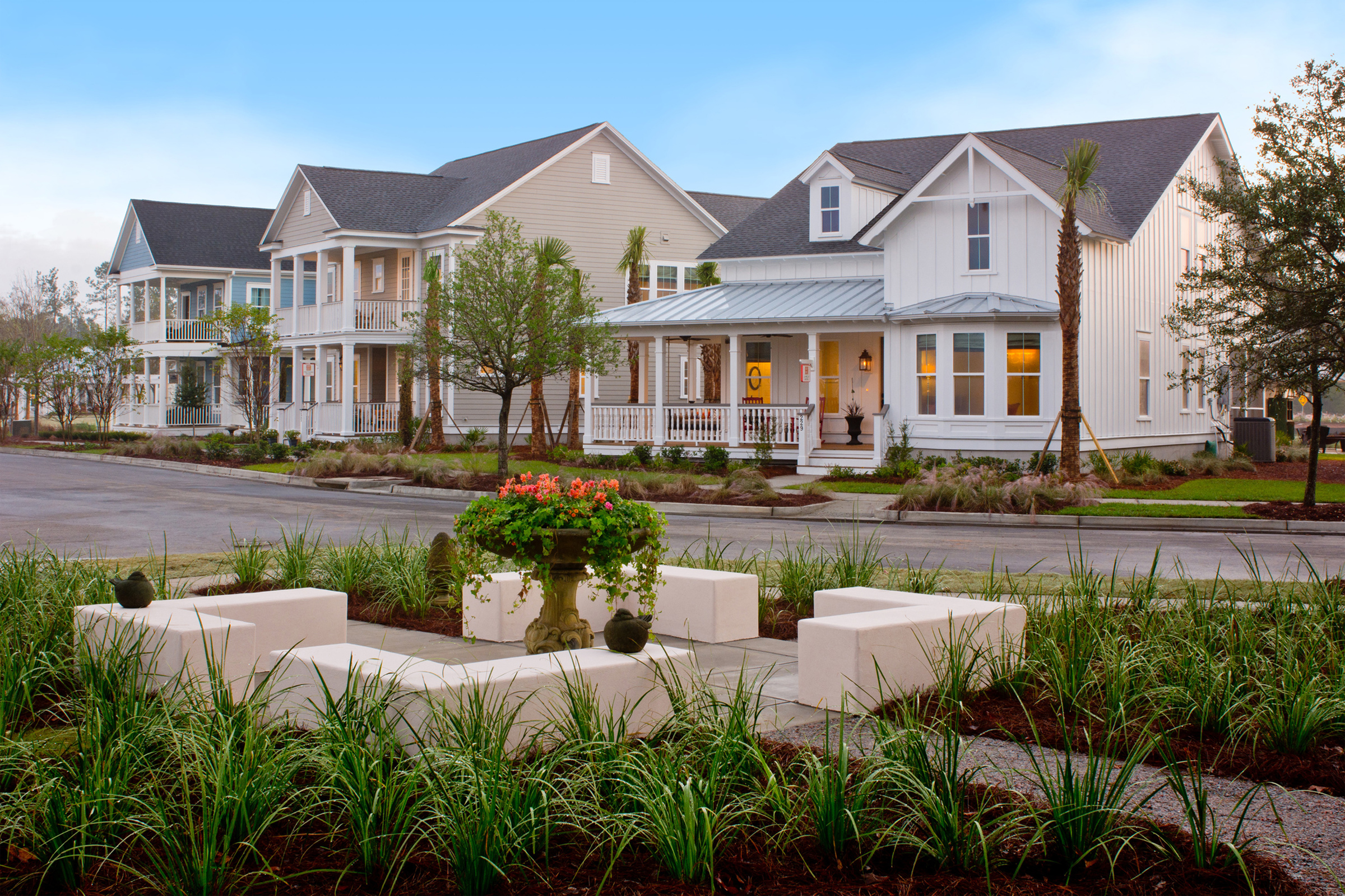
Every year, paint companies release their color of the year. This year’s colors include Behr’s “Rumors” – a deep ruby-red tone, PPG’s “Purple Basil” – a deep purple with red undertones, Benjamin Moore’s “Cinnamon Slate” – a mix of plum and velvety brown, Valspar’s “Encore” – a deep blue, and Dunn-Edwards’ “Caramelized” – a terracotta tone. These are all interior colors, though Caramelized sounds like it might work on an exterior.
Exterior color trends tend to move more slowly than interior color trends. For years, it seemed the only color used was beige – to the point we coined it Builder Beige! Then came the popularity of the Farmhouse style. A white farmhouse in a sea of beige was initially refreshing, until you got an entire street of farmhouse white.
We like to think of exterior color as packages linked to an architectural style. Done right, It strengthens and enhances the style. Here are some familiar Architectural styles and their color personality.
- Craftsman showcases saturated colors like moss, taupe, or muted brown with accents of brick red or dark teal.
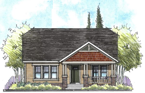
- Coastal would be composed of light, bright, and breezy colors like a soft white, seafoam green, or blue sky with accents of navy or coral.
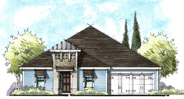
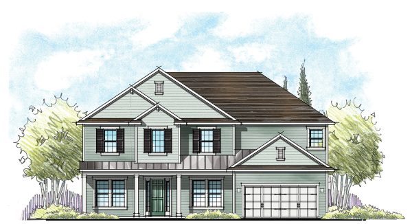
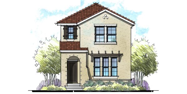
- Mediterranean or Spanish Revival would feature warm colors like terracotta, ochre, warm white, or clay with accents or dark wood or olive.
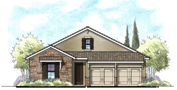
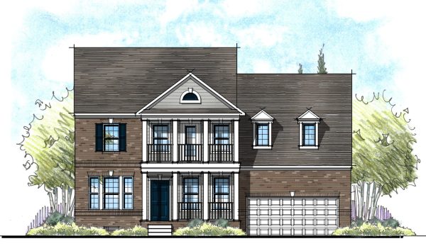
- Colonial Revival might feature base colors of cream, soft gray or muted yellow with accents like black shutters and brick red front doors.
But we are seeing a shift away from these more traditional styles. Hence, we need to consider different exterior color palettes.
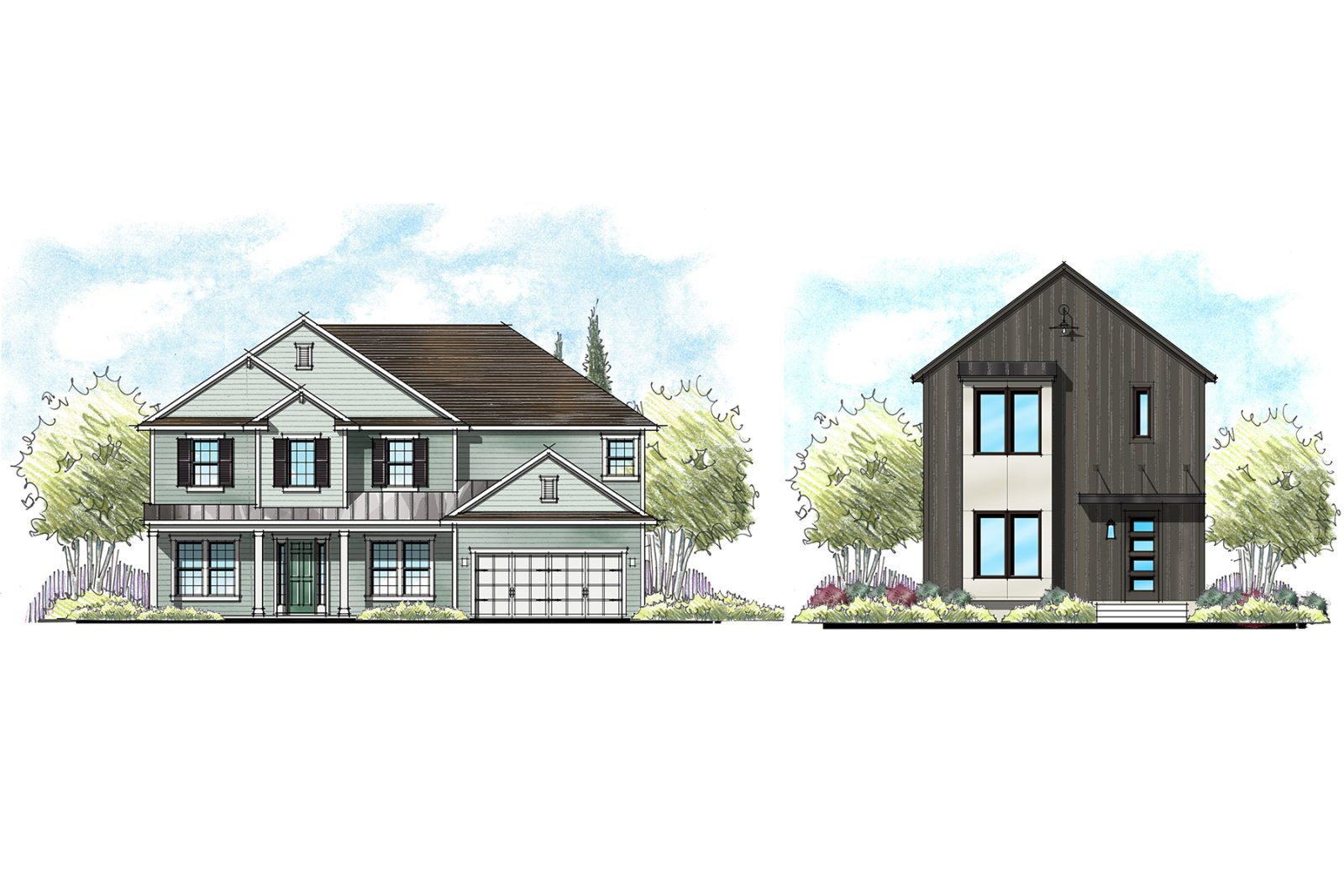
- A Modern color palette would include neutrals like charcoal gray, taupe, and warm whites with accents of black, navy, or olive green.
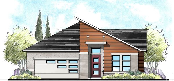
- Mid-Century Modern could include base colors like white or beige with accents like turquoise, avocado, or orange.
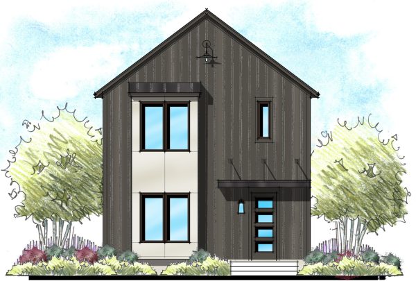
- Modern Rustic might feature more earthy tones like weathered brown or cedar with accent like charcoal, rust or soft black.
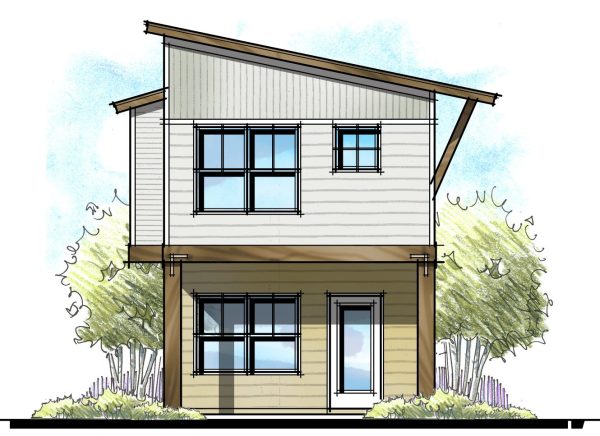
Color Placement
These new styles also include a new application of color or color placement. In the more timeless styles, we would see a medium toned body color with lighter trim around the windows, doors, and corner boards with accent colors on front door and shutters.
In the modern styles, we are seeing more color blocking where entire sections of the home or townhome use a different, high contrasting color. This is a very effective way to break up large wall areas, so we see color blocking used in a lot of multifamily homes.
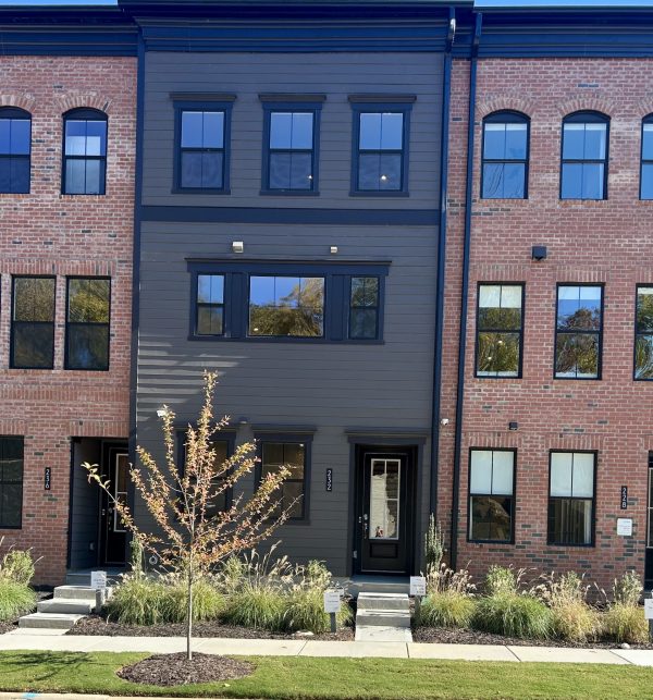
The color of the trim around windows, doors, exterior corners, and even floor bands are taking a different approach to color choices in Modern styles. Instead of light trim on a medium body color, we are seeing both darker trim colors on the lighter sections of the building and lighter trim on the darker sections.
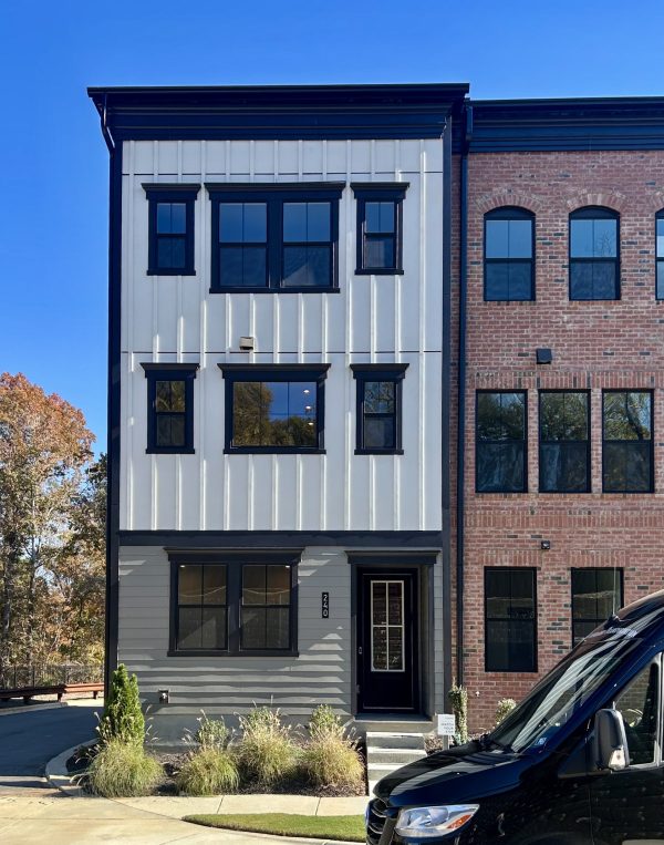
Often, the size of the trim is exaggerated – but the key takeaway here is the degree of contrast. There is a high degree of contrast not only between the trim and the body colors but also the body colors as well.
Mixing Old Styles with New Colors
If you’re a builder with an existing line of house or townhomes, should you consider more trendy color palettes like charcoal to freshen up your exteriors? It would certainly be a faster, less expensive option than entirely new exteriors. If this is the route you want to take, I would proceed with caution. I recently saw a light charcoal gray shake on a creamy yellow exterior that looked incongruous. Not only did the colors not relate well, but also application look odd.
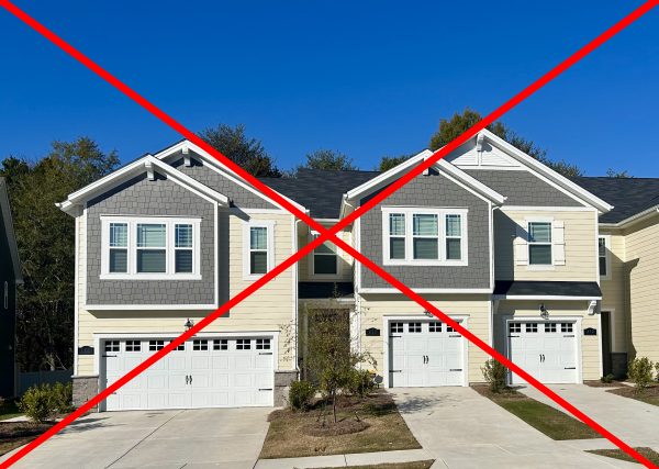
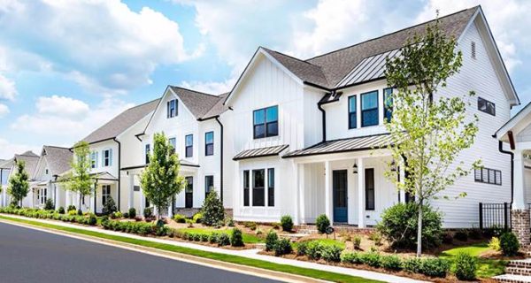
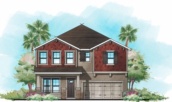
Instead, I would recommend using colors true to a style but with a refreshed approach. Check out this house below, it’s surprisingly revitalizing to see darker trim on lighter siding!
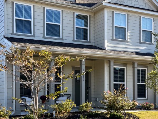
I would not recommend the high degree of contrast like we see in the modern styles. You can also include more saturated body or second body colors. Perhaps the reason we got so tired of Builder Beige was not only that it was the only color, but the color value was all the same. We all got tired of bland colors with little or no contrast.
Think Streetscape
Charcoal gray has the risk of becoming the next Builder Beige. An entire community in only saturated neutrals can get not only monotonous but also a bit downtrodden. Indeed, many communities would prohibit it. But adding a mix of materials like brick or stone and varying the saturation from one house to another can add life and animation to the streetscape.
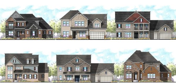
Don’t forget to use color.
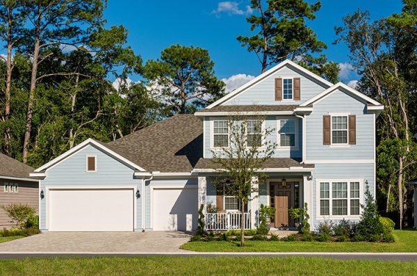
One of the biggest dangers I see with these new modern exteriors and color palettes is the shift away from actual colors like blue, green and reds. I love color. I used to live in a blue house with brown shutters.
I love pairing a soft moss green with browns.
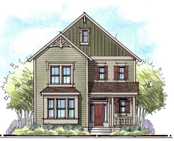
Of course, anyone who has met me knows immediately that my favorite color is red – and a Craftsman with brick red shakes as a second body color is rock star in my book.
Color selection can be a daunting task, especially when considering the exterior of a house. We have an exterior colorist who can help, reach out if you need help with exterior colors!
Categorized in: Exterior Colors, Uncategorized
This post was written by Housing Design Matters
